Executive Proposal Developed by:
BRND CRTV
The JARVIS Evolution:
ELECTRIFYING THE BRAND!
Use a desktop for the best viewing experience ;{)
Scroll Down
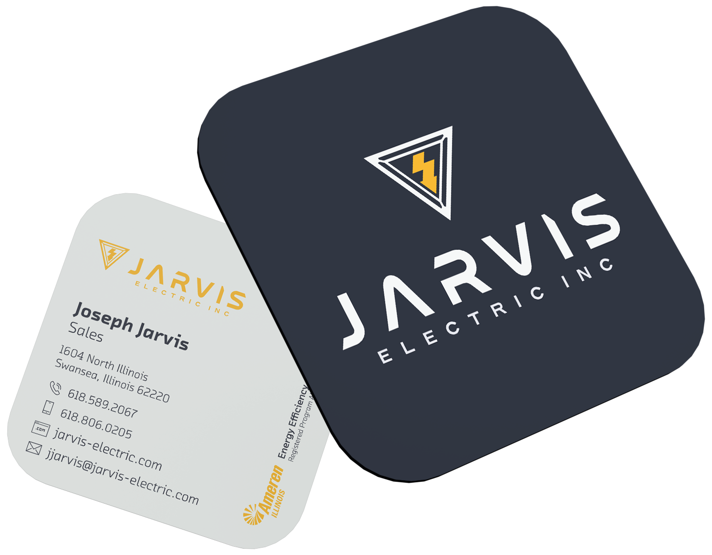
Built with absolute geometric symmetry and crisp, high-voltage mechanics, the emblem brings to life the clean, modern authority of a premier electrical contractor leading the local trade market.


Great brands do not stop growing; they amplify their success. The core objective behind this visual refresh by BRND CRTV (Brand Creative) was to honor the strong reputation Jarvis Electric has built and catapult it into a bold, modern era. We wanted to elevate the brand presentation to perfectly match the elite technical skill and advanced energy capabilities of the family business. By seamlessly melting precise high-tech geometry directly into sharp, architectural typography, we created a unified, deeply intentional mark that leaves a lasting impression on residential homeowners and commercial property directors alike.
THE ANATOMY OF THE MARK: TYPOGRAPHY MERGES WITH TRADEMARK GEOMETRY
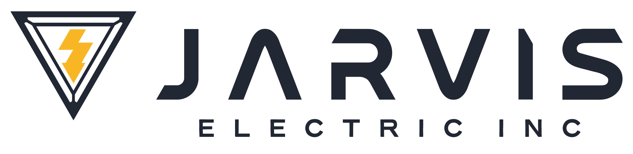
The breakthrough of this design lies in its fluid, unbroken geometry, where lettering naturally transitions into a powerful and recognizable energy symbol.
The Connected Identity: The stylized geometry of the custom-cut letters creates a balanced, forward-thinking layout, establishing an immediate and highly professional visual focal point.
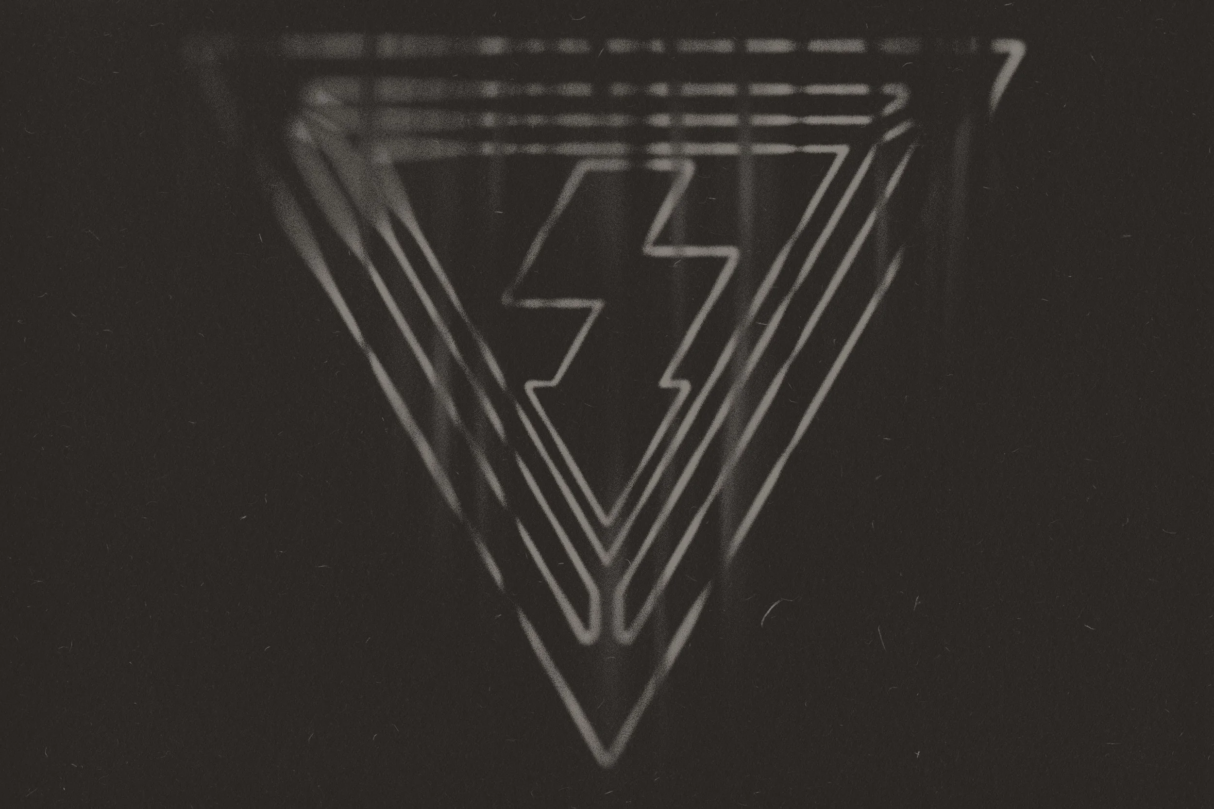
The Flawless Element Integration: The sharp, inverted triangle frames the core graphics beautifully. Its clean boundary seamlessly structures and focuses the inner dynamic lightning bolt, gracefully anchoring the design to the company name below.
A Unified Thought: This layout ties the cutting-edge typography and energy iconography into a singular, cohesive branding mark. It tells the complete story of precision, craftsmanship, and modern electrical solutions in one glance.
Style Guide
Light
Dark
THE COLOR ARCHITECTURE: STRATEGIC PALETTE DESIGN
The color strategy for this identity is deeply purposeful. Every tone was selected to solve a business need, maximize visibility, and highlight the geometric precision of the new logo design. Rather than applying a single color across the entire operation, the palette uses a multi-tiered layout to visually organize the company’s services and divisions on the road.
ENGINEERING TRUST & ACCENTUATING LOGO GEOMETRY
The core colors—Executive Navy, Safety Gold, and two distinct shades of Light Gray—were chosen to anchor the brand in trade authority and local reliability.
The Navy and Gold combination builds immediate corporate trust during sales consultations, ensuring estimators project absolute professionalism.
The two shades of Light Gray act as a modern, clean, and highly visible canvas for the service crews, offering a futuristic tech look while keeping the team looking uniform and sharp.
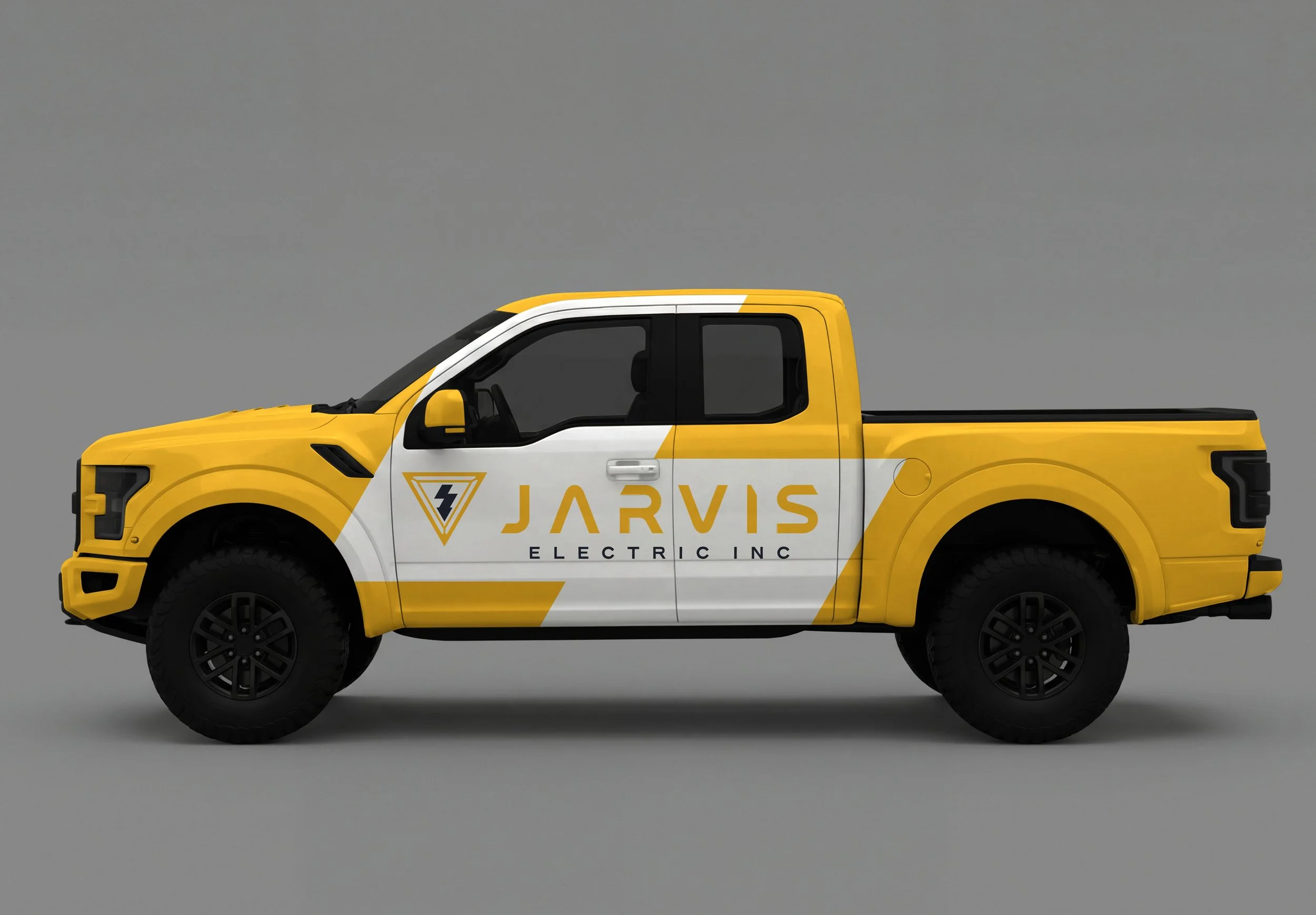
When applied to the new logo, these high-contrast combinations make the geometric frame pop vividly. The sharp angles of the logo's outer shield demand crisp, solid backgrounds to frame the artwork, while the safety gold brings the inner lightning core to life, ensuring the branding is instantly recognizable from a distance on any job site.
Color Palette
#222734
#F8B520
#f5f5f5
#2b2826
EXTENDING THE IDENTITY:
BRAND APPAREL & WORKFORCE PRESENCE
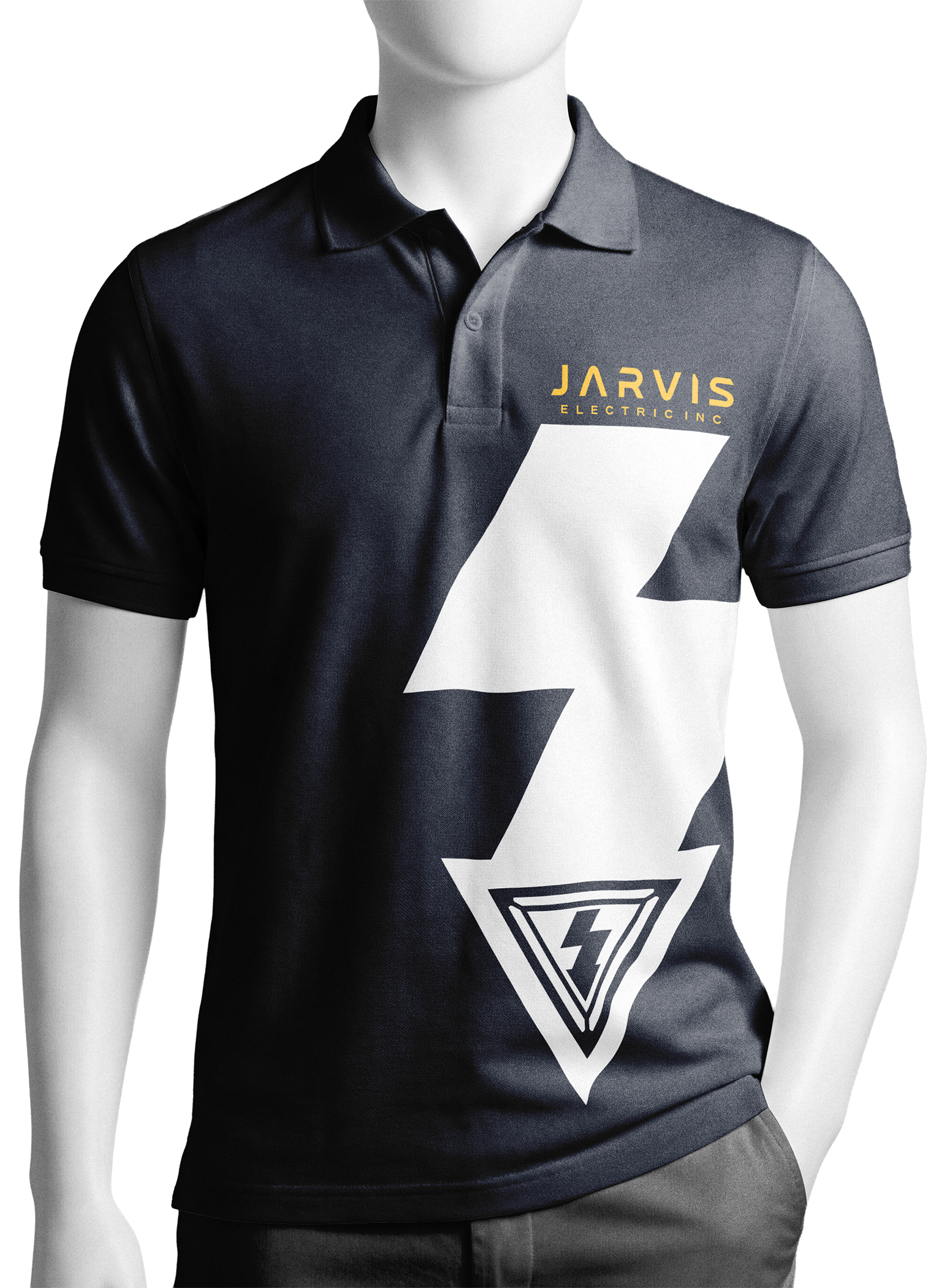
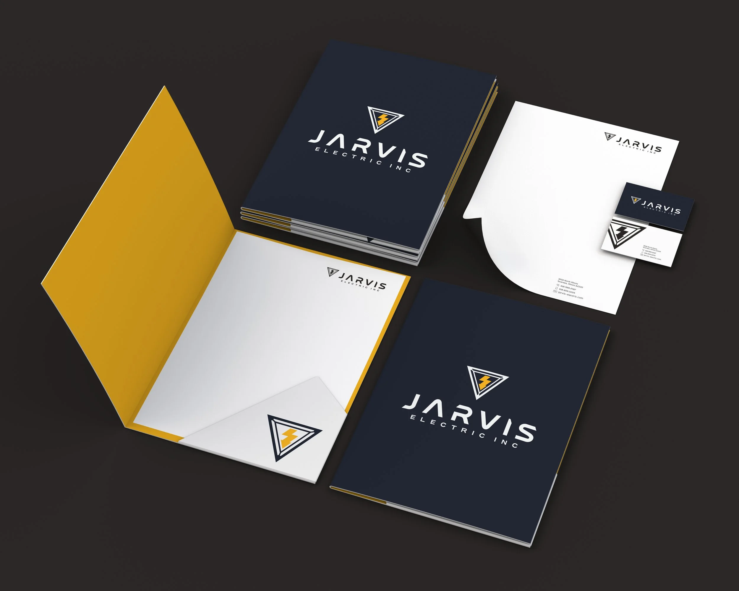
A truly professional logo doesn’t just stay on a screen—it lives in the real world. This visual identity is built to seamlessly scale into a premium, highly cohesive apparel line that the entire team will actually want to wear proudly on every single job site.
Sales Team
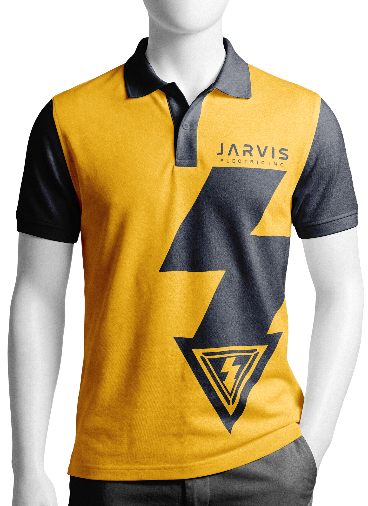
Field Team
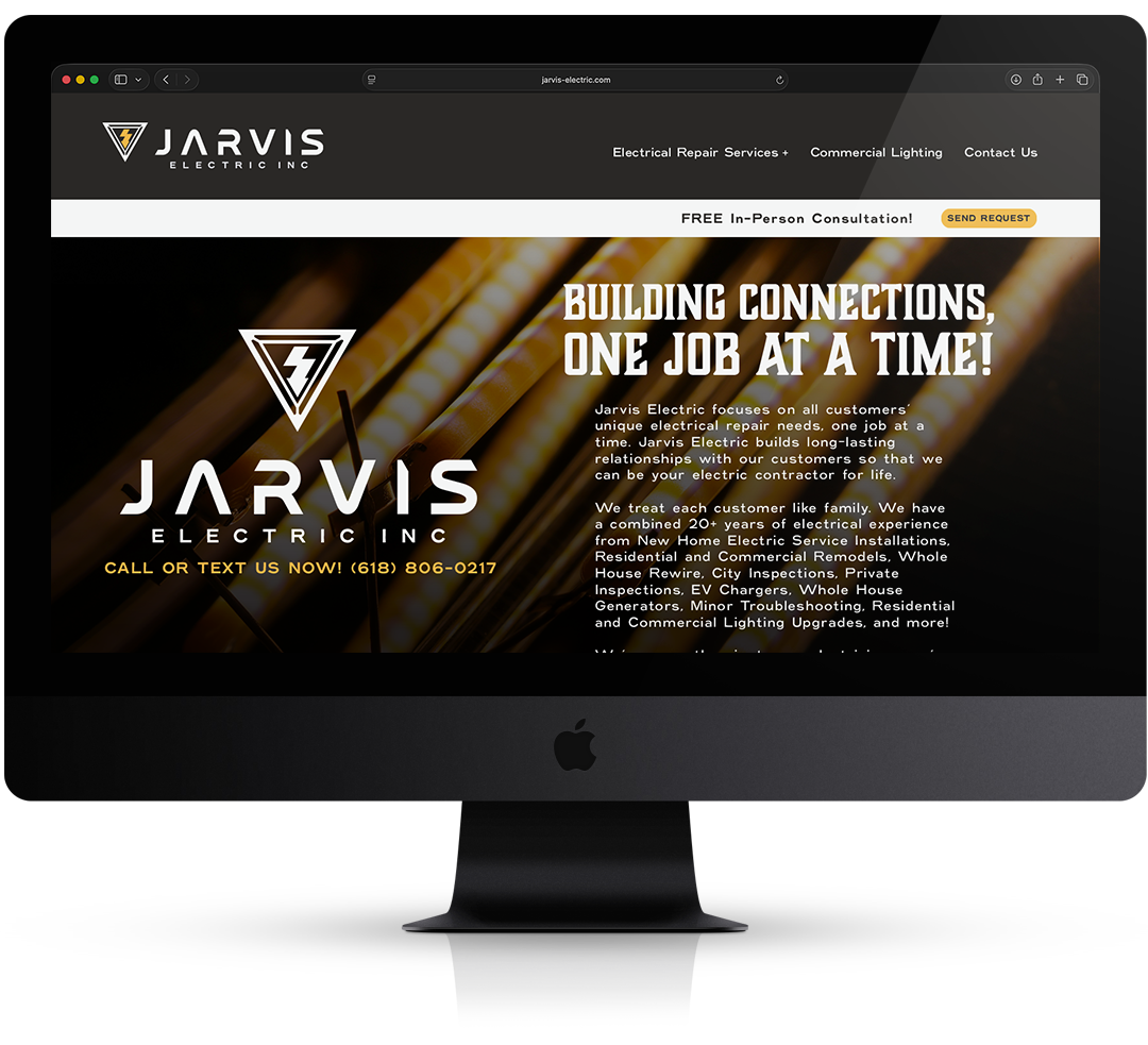
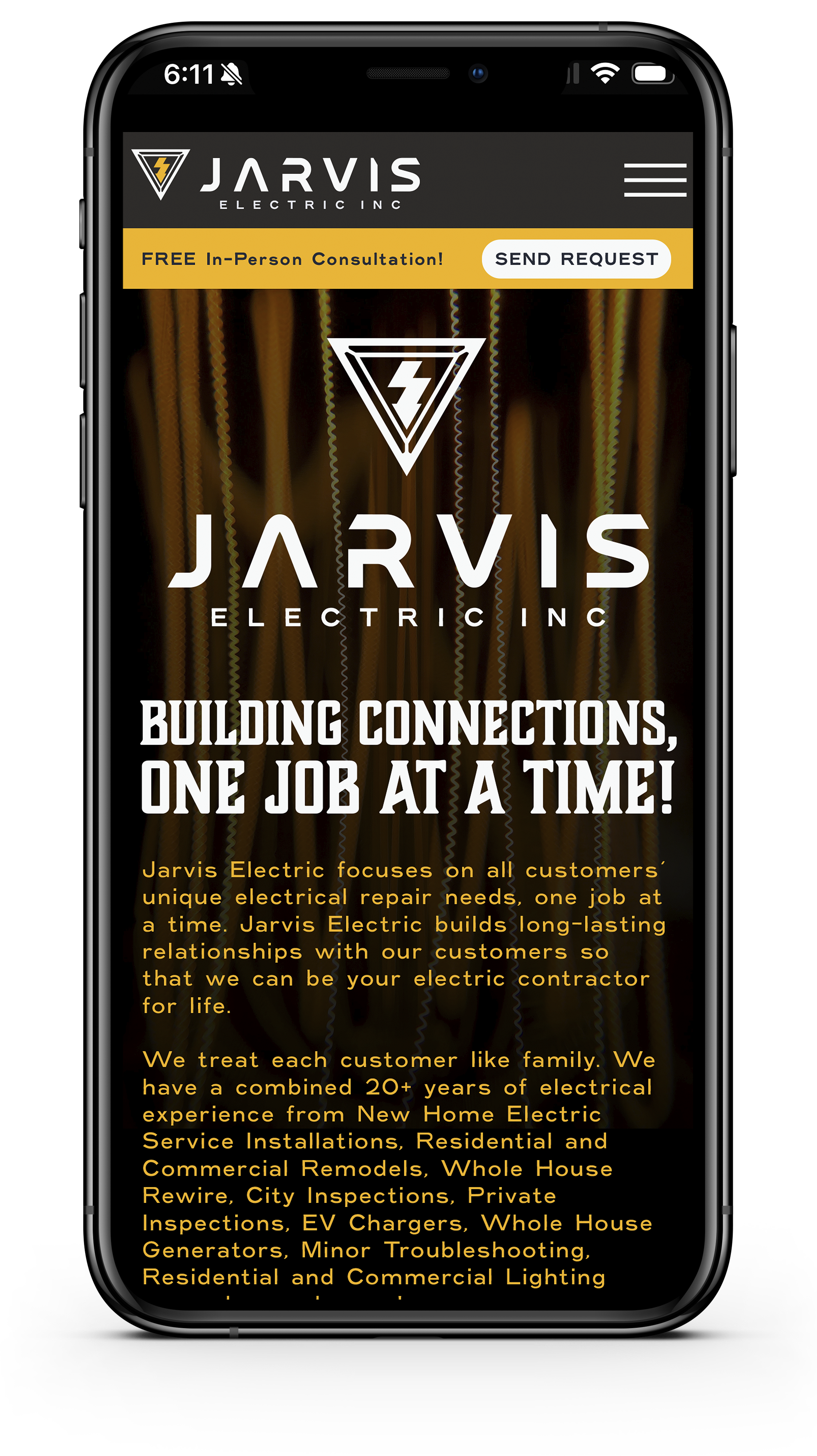
Desktop and Mobile website Layout
A great digital presence needs to convert visitors into customers on every device [Link: Jarvis Electric jarvis-electric.com. This layout shows exactly how the new visual identity transforms the digital customer journey with fluid interactions and responsive design:
Interactive Desktop Experience: The full geometric wordmark anchors a clean, high-end navigation header. Smooth hover animations and dynamic service menus guide commercial and residential users effortlessly to request a quote.
Responsive Mobile Website: The platform scales down intelligently for smaller touchscreen browsers, prioritizing fast load times and an optimized layout structure so local clients can browse services easily without cluttering the screen.
Thumb-Friendly Actions: Critical interaction elements—like the "Call Now" button and emergency request forms—are strategically locked into a sticky mobile bar, allowing homeowners to connect with dispatchers in a single touch.

OWN THE VISUAL REVOLUTION
ACQUIRE THE COMPLETE BRAND & MOTION SYSTEM.
We are prepared to hand over the digital keys to this unforgettable, iconic lifestyle identity to help drive JARVIS ELECTRIC next era of market growth. To discuss acquisition pricing, contract structures, or file transfer timelines, reach out to us directly.
ONE LAST THING BEFORE YOU HEAD OUT...
EV Style Guide
Light
Dark
THE COLOR ARCHITECTURE: THE NEW EV & GREEN-ENERGY DIVISION
The color strategy for this specialized identity is deeply purposeful. Moving beyond traditional maintenance, this vibrant architecture is engineered to launch the new Jarvis Green-Energy Division, instantly positioning the company as the region's elite authority in high-growth, high-margin modern energy infrastructure.
ELECTRIFYING FUTURE GROWTH & MARKET DOMINANCE
The introduction of Tech Teal and High-Voltage Yellow, balanced seamlessly by a crisp Light Gray and Executive Navy base, creates a forward-thinking visual identity that sets Jarvis Electric apart from general contractors.
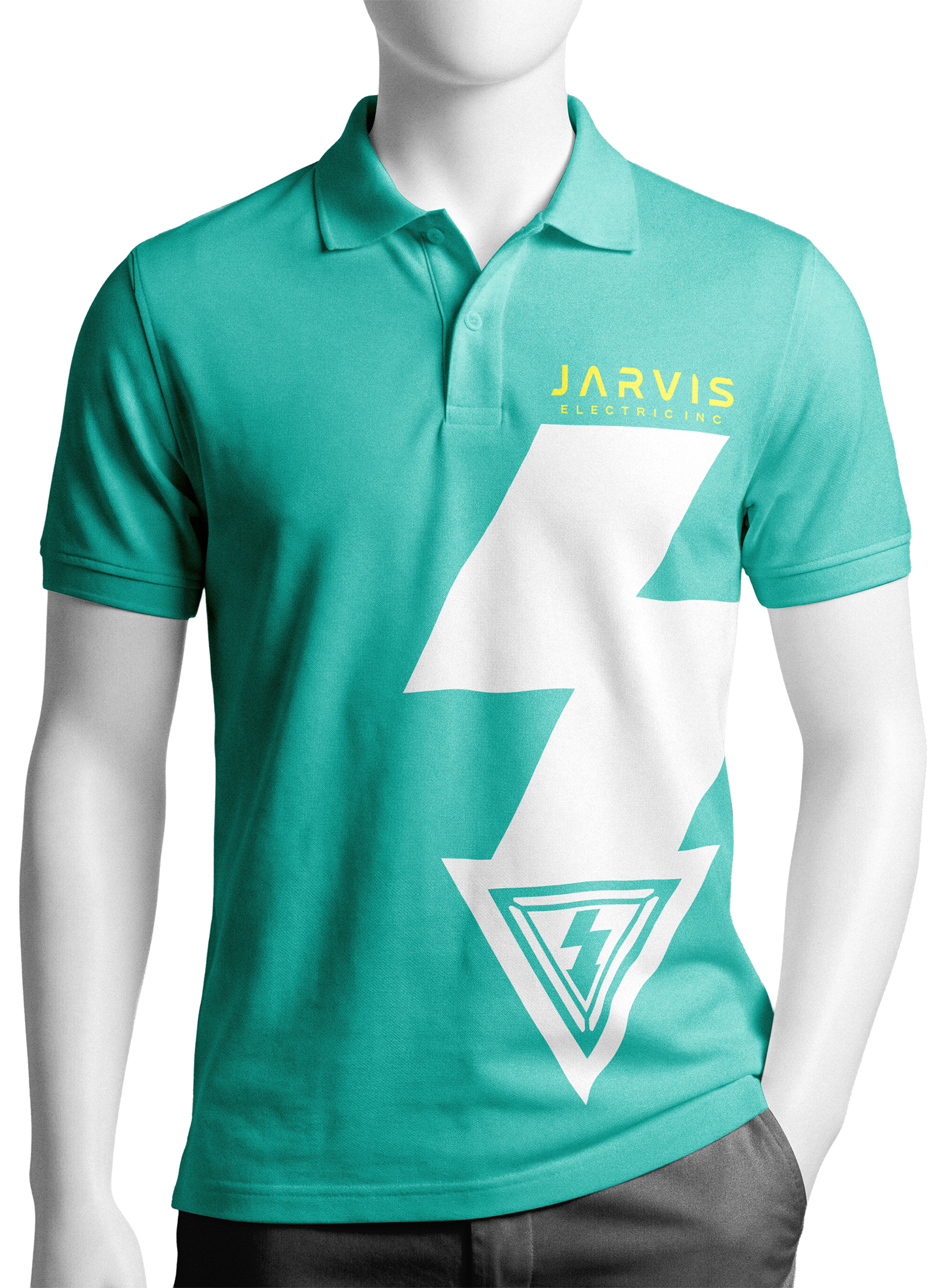
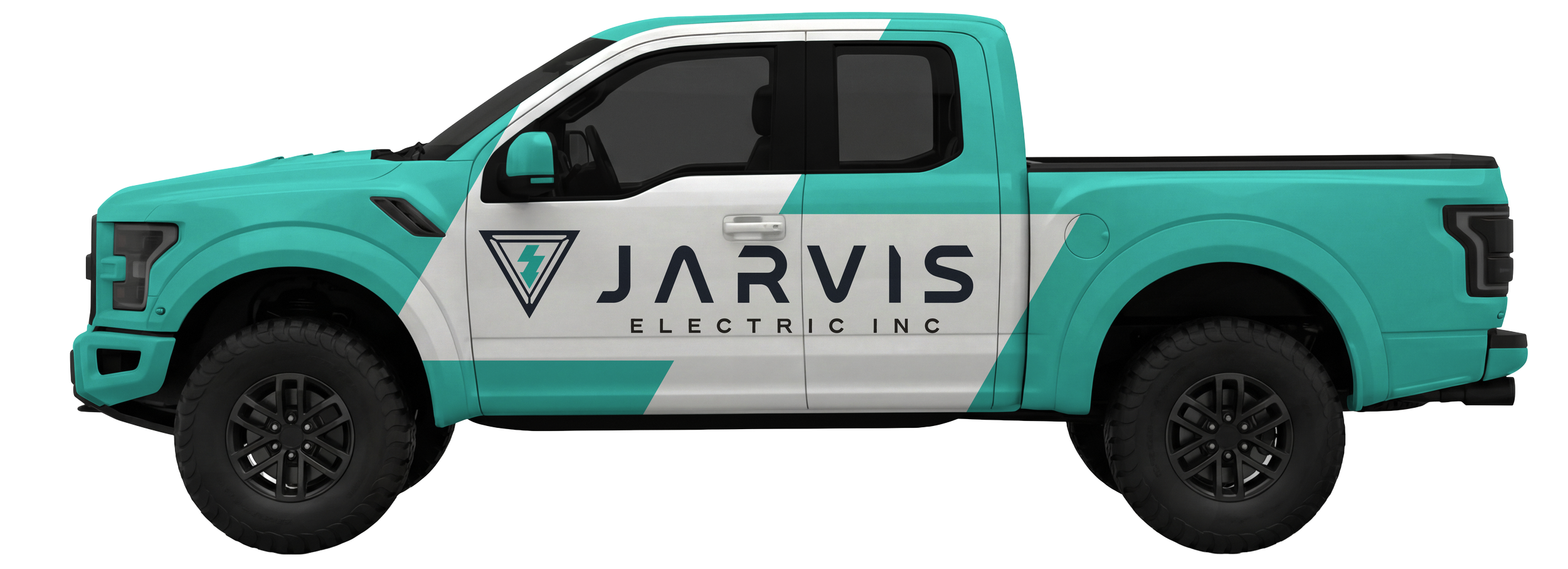
EV & Home Charging Stations: The tech-teal body mimics clean, zero-emission automotive cues, establishing immediate authority the moment your vehicle parks in a residential driveway to set up a smart vehicle charging system.
Solar Power Systems: The brilliant, live-current yellow accent represents pure, localized solar power extraction, signaling to neighbors that Jarvis is certified to handle advanced renewable residential grids.
Whole-Home Backup Generators: By anchoring these vibrant eco-tech accents to a modern light gray and navy structure, the uniform still communicates heavy-duty, industrial-grade mechanical reliability. This projects absolute security to homeowners investing in premium automatic emergency backup systems.
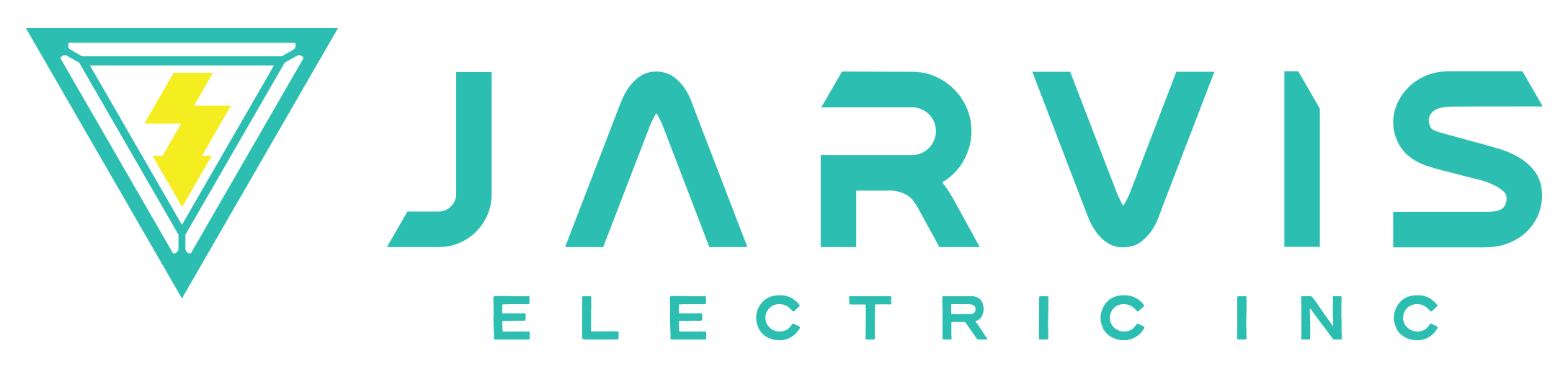
When applied to the new logo layout, the stark white structural lightning bolt slices through the tech teal to create a massive, unmistakable road presence. This distinct palette turns every service call into a powerful, passive neighborhood marketing engine that captures the modern eco-conscious homeowner.
Color Palette
#38bdb1
#f8ec1e
#f5f5f5
#222734